I have completed migrating from the sixth to the seventh generation dedicated server architecture, and the sixth generation hardware will idle from now on probably until its rental expires in the summer. So far, so good – to date it’s running very well, and the difference in terms of email client speed is very noticeable. It was a fair few months to get it done, and probably at least fifty hours of my time between all the researching and configuration etc. But that should be my public server infrastructure solved until I’m fifty-five years old or thereabouts.
Also some months ago I happened to be reading Hacker News where somebody mentioned that ancient Roman coins are so plentiful that you can buy bags of them for not much money at all. That kinda led me down a bit of a rabbit hole, it turns out a surprising amount of ancient coinage has survived – probably for the dumb simple reason that it was valuable by definition, so people went out of their way to retain and preserve it. You can, off eBay, get a genuine Greek solid silver tetradrachm made during the reign of Alexander the Great for under €100 if you bid carefully at auction – complete with portrait of the man himself! As much as buying a whole load of ancient silver and gold coinage has a certain appeal, it is a horrendous consumer of both money and time for which I currently have much higher priority uses. But I did see you can pick up unwashed Late Roman Imperial ‘shrapnel’ for cheap enough I reckoned it worth buying a few as a teaching opportunity for my children.
So I purchased ten unwashed bronzes for fifty euro, an absolute rip off considering you can get a thousand unwashed bronzes for under a thousand euro, but I suppose there are claims that mine would come from a checked batch with more ‘good ones’ in it i.e. legible ones. Well, after the kids had scrubbed them with toothbrushes and let them soak in deionised water in between a few times over several days, here are the three best of the ten coins:
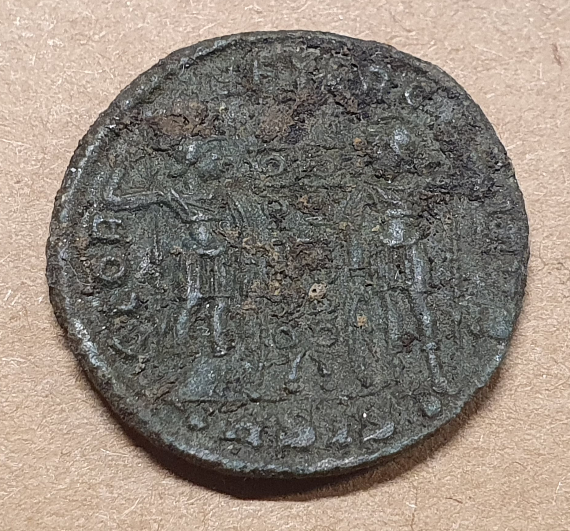

The first I reckon is a Constantine (unsure which); the second I think he’s Valentinian the third (425-455 AD); the third he’s not quite clear enough to make out, but almost certainly a Late Roman Emperor. A further three coins had a bust which could be just about made out, but not well enough to say which emperor, and of the remaining four, three only had some letters which could be made out with nothing else, and the last we could maybe make something out coin-like if you squinted hard enough – but neither writing nor bust.
Certainly an expensive way of learning about history, but hopefully one that they’ll remember. The key lessons taught were: (i) Long lived emperors turn up more frequently than short lived ones (ii) Emperors who debased their money by printing a lot of coin also turn up more frequently and (iii) we get a lot of Late Roman Imperial coin turning up because at the end of the empire, the owners of buried stashes either died in the instability or the stash simply became not worth digging up as Imperial coin isn’t worth much without an Empire to spend it in. Having hopefully communicated these three points to my children, I guess I can draw a line under this teaching opportunity.
Solar panel history for my site
In Autumn 2023 – can you believe it was nearly eighteen months ago now! – a virtual diary entry showed my newly mounted solar panels on the site. These eighteen panels are half of the future house roof panels and half was deliberately chosen as you cannot fit more than twenty panels per string, which implies eighteen on one string and twenty panels on the other string.
The Sungrow hybrid inverter has performed absolutely flawlessly during this time. The early days had many uncontrolled outages during the winter period as I hadn’t yet figured out quite the right settings (my first time installing and commissioning a solar panel system!), but by March 2024 I nearly had all the configuration kinks ironed out. Since then – apart from a ‘loop of death’ outage in November 2024 which was due a very rare combination of events – it really has been solid as a rock.
To be clear, if less radiation falls from the sky than is consumed by the security cameras and internet connection there, yes the batteries do run down and eventually the system turns off. I call this a ‘controlled outage’ because the system detects it will soon run out of power and it turns everything but the inverter off. It then recharges the batteries up to a minimum threshold before restoring power, and at no point does the system get confused. This is different to an uncontrolled outage where the inverter does not recharge the batteries for some reason, and enters into a fault condition requiring me to manually intervene on site.
That ‘loop of death’ I mentioned is an example. Previously, I had the system configured to never let the battery drop below 5% charge, and that worked fine. Unfortunately, last November what happened was a sudden drop in temperature after when the battery had reached 4% charge or so. Lower temperatures mean less battery capacity, so that 4% suddenly became effectively zero. This caused the computer inside the batteries to physically disconnect the batteries to prevent them getting damaged. When the sunshine reappeared, the physical switch connecting the batteries was tripped, and there was no ability to charge them. I didn’t notice this for a few days as it was an especially dull week of weather, only when it kept not coming back did I drive out to investigate where I was obviously appalled as if I couldn’t get any charge back into the batteries, I couldn’t prevent the physical safety relays from firing. That would turn several thousand euros of battery into bricks. That was quite a stressful morning. Still, I got them rescued, and I tweaked the configuration to henceforth never let the batteries get below 20% charge instead. That worked brilliantly – the entire winter 24-25 period of little solar irradiation passed without a single further uncontrolled outage.
Anyway, Sungrow offer an optional cloud service integration which provides remote management and remote monitoring via a phone app and/or website. If enabled, it records every five minutes the following measurements into its history database:
- Volts and amps on PV strings one and two.
- Volts and amps on each phase of the three phase AC output.
- Total DC power in kW.
- Total AC power in kW (from this you can calculate inverter efficiency).
- Battery charging or discharging power in kW.
You can get a whole bunch more measurements from the cloud interface, but as far as I can tell, the above are the only ones stored in a long term time series database. Said database is downloadable into your choice of CSV or Excel, however their export tool only permits thirty minute granularity if you’re downloading a month or more. That’s good enough for my use case, which is attempting to estimate how much power those panels could gather if all the power they could generate were used.
Daily hours of light
For obvious reasons, if the sun isn’t shining then solar panels cannot generate power. As we live quite far north, there is considerable variance in daylight hours across the year: approximately 7.75 hours at the winter solstice up to 16.75 hours at the summer solstice. That is 32% of the day for winter, and 70% of the day for summer. This is a best case – while solar panels work surprisingly well in bright cloudy days, they do not work well in dull cloudy days. A short day means less opportunity for thick cloud to pass within the hours of daylight.
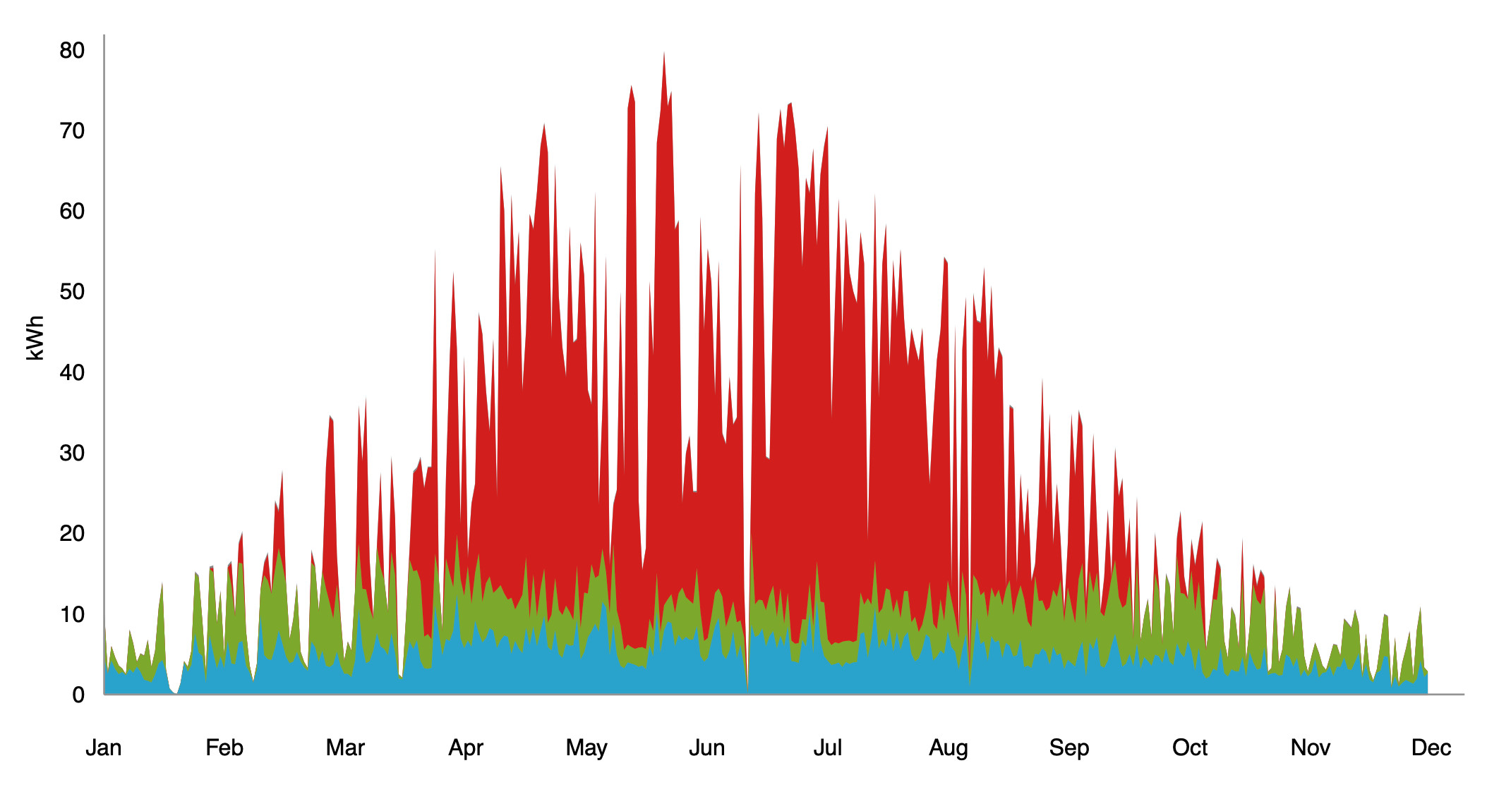
Solar panels, interestingly, develop their maximum voltage if radiation lands on them exactly perpendicularly. If it lands oblique to ninety degrees, you get less voltage, and indeed much of the recent technological progress in solar panels has come from increasing the voltage developed over a wider angle. Voltage will appear with almost any amount of light – indeed, as my time series history clearly shows, a full moon on a clear night will generate more than fifty volts across those eighteen panels. You won’t get more than a few watts out of it, maybe enough to charge a phone, but it’s not nothing. I can also see that peak voltage – around 730 volts – clearly happens in winter, whereas summers might not beat around 690 volts. This is because these panels are mounted at 45 degrees, and when the sun is high the angle is quite oblique to their perpendicular. In any case, we can tell when light reaches the panels by when voltage appears on the PV string, and for our graph below we count the number of half hour slots with more that 500 volts appearing on the PV string.
The next bit is harder. The batteries start charging as soon as enough power appears on the panels that it is worth sending some to the batteries. Having stood next to the inverter, I can tell you it appears to determine how much load it can put on the panels by incrementally scaling up how many amps it draws from the panels, and if the voltage droops it backs off. I can tell this from relays clicking, and a volt and current meter attached (note that standard consumer multimeters cannot handle > 500 volts! You need a trade multimeter for this). Obviously, the time series we have doesn’t capture any of this, and only reports how many kW was flowing into the battery at any given time. And once the battery is full, it stops charging it.
This tends to mean that only the very beginning of each morning charges the battery, and therefore our only measurements for estimating how much power these panels can gather are for the very start of the day only. This matters, because solar irradiation has a curve like this:
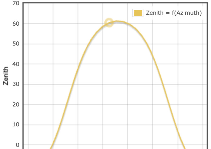
… where zero is the horizon, and that curve is for June 20th at my latitude. This means solar irradiation reaches two thirds full strength four hours into the day, so measuring capture for only the first few hours of the day will grossly underestimate total capacity to capture for a whole day. I therefore need to ‘undo’ that curve which looks to be approximately x2 or x4.
Anyway, I chose x0.25 and here is the year of 2024 (I actually tell a small lie – Jan/Feb are actually 2025, because of all the uncontrolled outages in Jan/Feb 2024. It’s why I was waiting until March 2025 to write up this post):
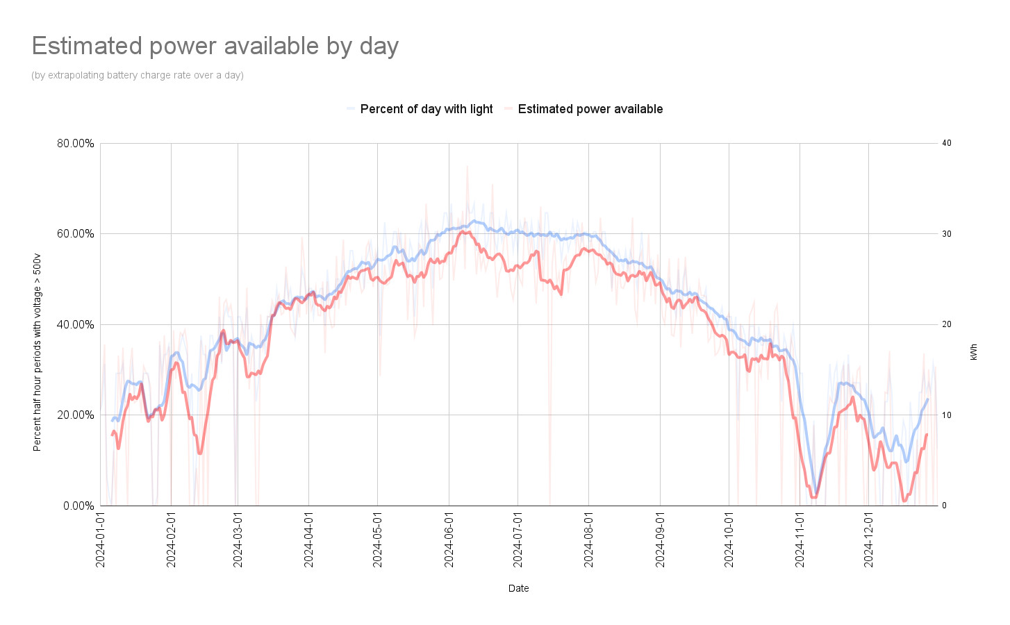
As previously described, the blue line is the total number of 30 minute periods with more than 500 volts on the PV string – this strongly tracks the number of daylight hours, unsurprisingly, with the variance due to cloud cover. As mentioned above, ignore the dip in November with the ‘loop of death’, and do bear in mind that for Nov-Dec-Jan-Feb there can be occasional gaps in the data due to controlled outages due to lack of power raining down from the sky. Obviously if there is no power, there is no internet, and the numbers then don’t appear on Sungrow’s cloud service. This artifically depresses those months, but it also artificially boosts them because the batteries will often suck in 8 - 10 kWh in a day during those months which makes that day look unusually good.
Something perhaps surprising about the blue line is it ranges between 20% and 60%, rather than between 32% and 70% as described above. The answer is simple: geography. We have tree cover to the west which chops off the end of the day in the summer, and mountains to the south which chops off both sunrise and sunset in winter. The panels are mounted on the ground so they are particularly affected by geography – once onto the house’s roof, that effect should be markedly diminished.
The red line is the estimated number of kWh available per day based on the rate of charging in the morning descaled by x0.25, and then linearly adjusted to match this estimate of solar PV production from my house’s PHPP computer model of its predicted performance:
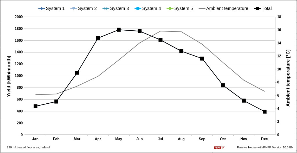
This is for thirty-seven panels, so divide everything by two to get what PHPP thinks ought to be the solar PV yield for this location. I matched my estimated graph such that Jun-Jul matches what this graph predicts (~27 kWh/day), as does Dec-Jan (~10 kWh/day).
So, the obvious elephant in the room is that the curves of both graphs don’t match! To be honest, the PHPP graph looks like the sunrise graph whereby due to how the planet rotates whilst also going around the sun, sunrise gets earlier quicker in the beginning of the year. This might be a bug in PHPP? I have a second set of kWh per day estimations for the house from the Easy PV website:
Now that looks more like my graph! There is an off-centre bias towards Apr-May, and a similar raised tail Aug-Sep to the PHPP estimate, but it’s less pronounced. Easy PV also thinks a bit less power will be captured in summer, but especially in winter (the red is contribution back to the grid; the green is charging of battery; the blue is consumption).
My graph does show a raised tail Aug-Sep, but no off-centre bias towards Apr-May. But do you know it could be as simple as that the weather in 2024 in Apr-May was unusually cloudy? It’s entirely possible, each year’s graph will have its own shape, and only by averaging say ten years of them might you get the shapes that Easy PV and PHPP show.
Perhaps a future virtual diary entry here might average all the annual results and find out?
The next virtual diary entry
Which brings me onto the likely topic of my next virtual diary entry here.
I haven’t written here about geopolitics in a very long time, certainly decades. It’s not that I haven’t been keeping up to date and well informed, rather to be honest I don’t think my thoughts on it are worth typing up in my very limited spare time. If I am to invest multiple hours clarifying my thinking onto this virtual paper, generally it is because of:
I need a searchable record of my past thinking for future projects. This has been 65% of everything I’ve written here in certainly the past fifteen years.
It helps me to clarify what I am actually thinking by writing out prose to describe that thinking, even if I never expect to need to refer to that thinking again in the future. This might be as much as 30% of everything I’ve written here in the past fifteen years.
And because my thinking on geopolitics usually really doesn’t matter, it isn’t worth investing a non-trivial amount of my free time to write it up.
I am one of the few I believe to have correctly predicted the current secession of the United States from its colonial outposts in Europe in approximate timing, form and nature. Because I never wrote any of that down, only the people who know me well enough to have heard me blabbing on about all this since a few years after the financial collapse will be able to confirm it. I made the suspicion roughly after returning from working for BlackBerry in Canada, it got confirmed with how the first election of Donald Trump came about, and obviously we are right now in the beginning of said secession.
Most of such ‘pub bar talk’ material is harmless and irrelevant – a hobby thankfully usually not punished for doing it publicly in the collective West, unlike in most of the rest of the World. But when trillions of euro will be spent and billions of lives are about to radically change from the trajectory they were previously on, now it actually matters enough to be worth writing up here.
My family, but also my friends, my neighbours, my colleagues and indeed my people will now not live the rest of their lives along the patterns previously assumed. Seeing as they rather matter to me, I ought to clarify my thinking on this topic in order to have my best guess at what will happen in the future before I die. Only then can I guide those I care about in the right directions as best I can.
So I need to write something up. It will likely take me several weeks to phrase it correctly. But I do think it needs doing.
If you’re interested in such things, watch out for that here. If you’re not, remember to skip the next post! Until then, be happy!
| Go to previous entry | Go to next entry | Go back to the archive index | Go back to the latest entries |